We’ve Got
Your Back
Loantime
OVERVIEW
Time For a Healthier Loan
Loantime is a new way to finance health procedures through easy, no-gimmick loans independent of insurance companies and bureaucracy. OffWhite built the brand’s market strategy from the ground up, and crafted a complete identity system and aesthetic, from logos and typefaces to web design and UX. We designed Loantime’s web presence to be clean and fun, and streamlined its application and approval processes to be consistent across client and customer experiences. A fresh approach fitting for a pioneering brand.
SERVICES
Facilities (B2B)
Loan Operators (B2B)
Consumer loans (B2C)
STRATEGY
Naming
Branding
Illustration
Animation
Software Design
UX/UI
Web Design
Strategy
Market research indicated that the healthcare industry suffered from a lack of financial organization on every level. Providers had trouble keeping track of procedure funding, and customers had trouble arranging the money in the first place.
The field was ripe for disruption, and that’s where we stepped in. Loantime is a single platform for all parties to effortlessly coordinate the financial side of healthcare treatments. Simple and easy for everyone.

Branding
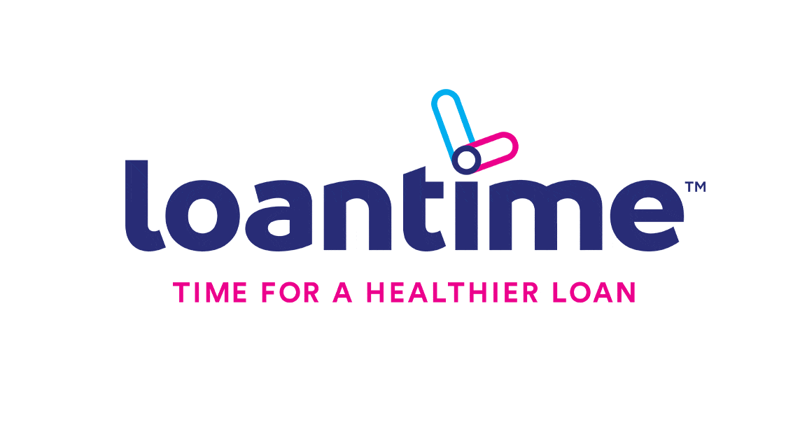
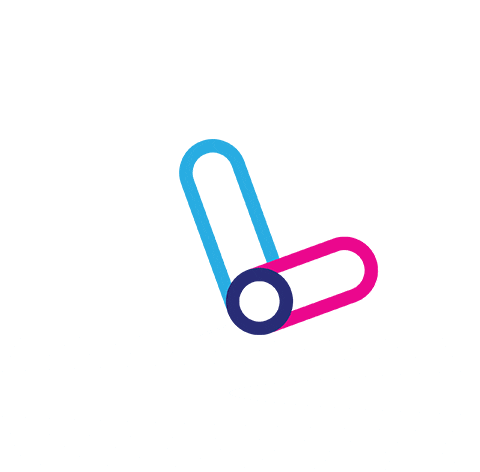
LOGO
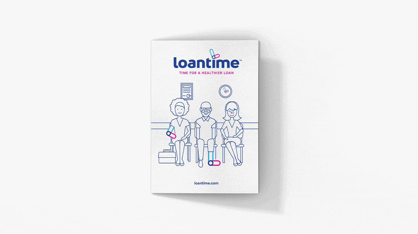
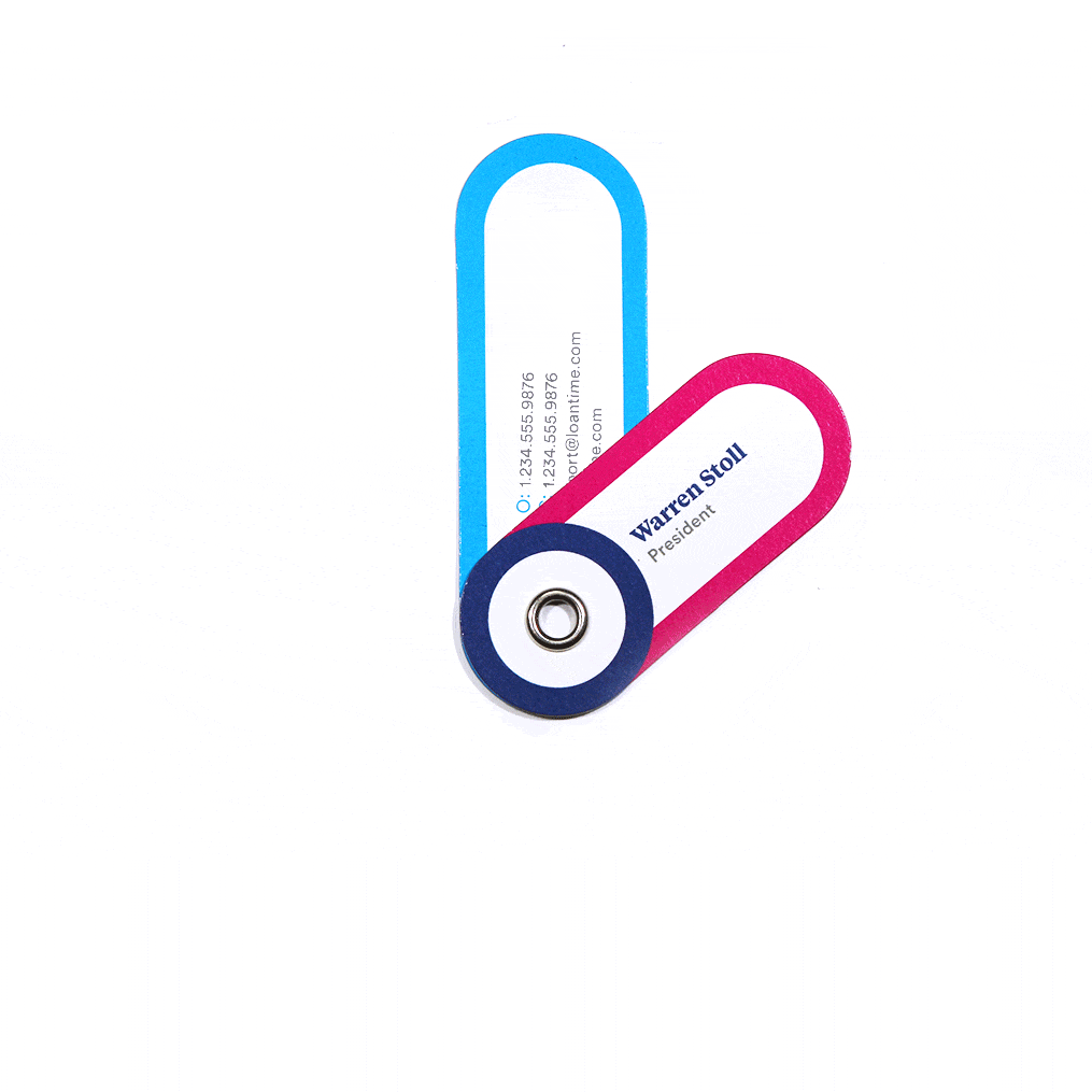
A great brand starts with a memorable logo. The letter “L” meets the hands of a clock, reflecting both “loan” and “time.” Our approach was to mix bold, pop colors, a unique, curvilinear typeface and a minimalist, recognizable image to craft brand language that could be identified by customers and providers in a broad variety of tones and settings.
ILLUSTRATION
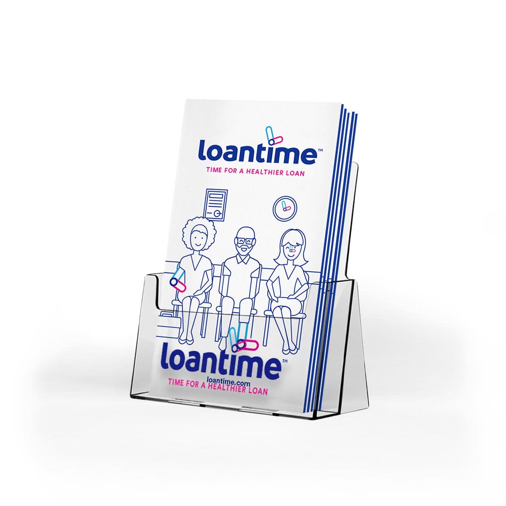
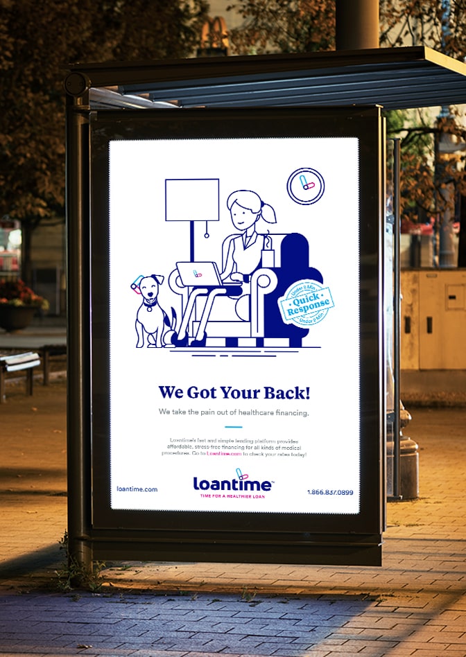
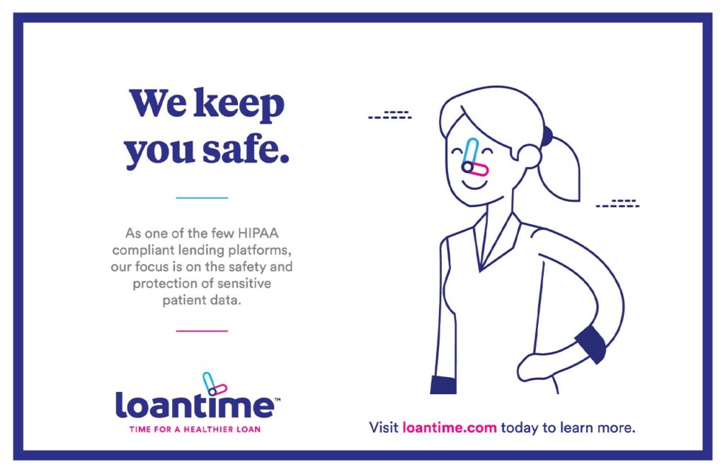
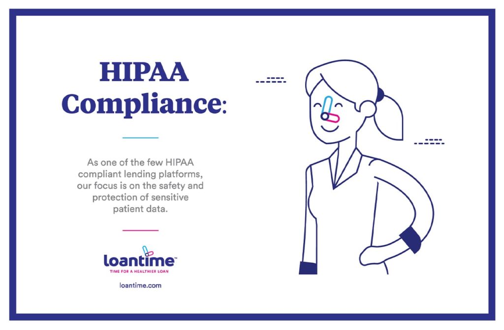
Health procedures can be scary. Therefore, in addition to making Loantime easy to use, we incorporated fun illustrations of patients from all walks of life with whom customers could identify. We also stuck in some adorable dogs. All images feature Loantime’s signature “L” logo. Who knew health financing could be so awesome?
ICONS
In line with the approachable branded illustration stylization, each call out used on print and digital needs infuses the magenta/blue palette with pleasant iconic design language.
CREATIVE LANGUAGE
For the illustration approach Loantime needed creative language that would harmoniously communicate to a B2C as well as B2B environment without looking inappropriate to either demographic. Our solution carried equal relevance to both Loantime’s consumer-facing audience as well as medical facilities and banks institutions.
CONSUMER
FACILITY
UI/UX
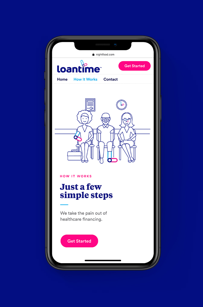
WEBSITE
We designed a beautiful, unified platform for healthcare providers and consumers to reach each other. No clunky back-end straight out of 2009 — for all parties, the website retains the same aesthetic and user experience, incentivizing everyone to continue borrowing and providing through Loantime.
Collateral
OffWhite designed a complete visual campaign for Loantime, centered around illustrations, friendly messaging and ease of use. Engineered primarily for point-of-purchase advertising, it is adaptable to just about any forum or medium.